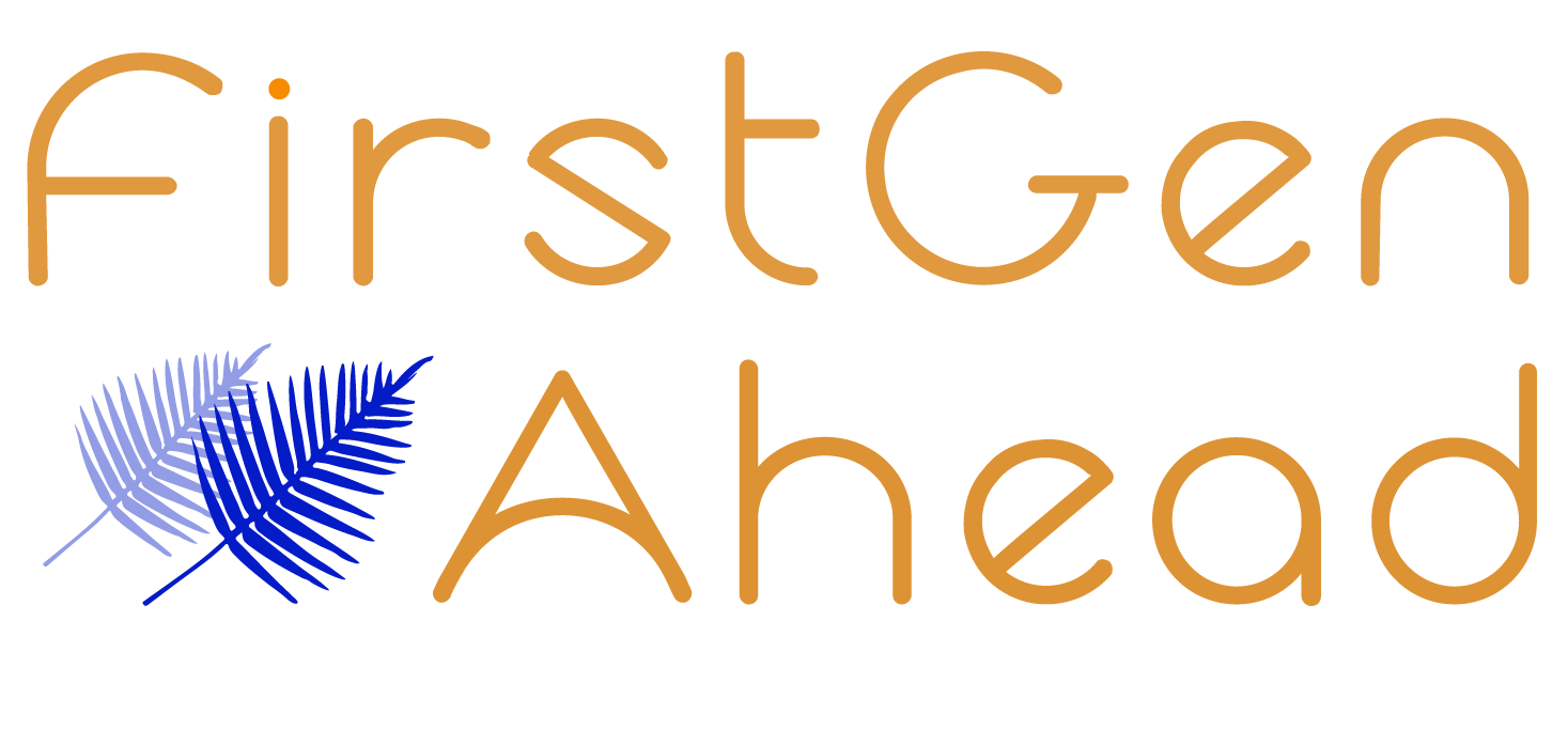
 Thanks to the creative talents of Boston University junior and FirstGen Ahead student, Selina Li, we have a new logo! It’s displayed on our newsletter banner.
This new logo is one of three Selina designed, and it’s the preferred choice of 19/30 coaches, students, partners, and supporters polled.
In addition to being attractive, its symbolism includes:
- The orange and blue hues. These are complementary colors and are increasingly used to represent diversity.
- The ferns. The fern is a resilient plant and a symbol of growth. Resilience and the drive toward continual personal improvement are characteristics of our students. The two ferns represent the students growing together with their coaches.
- The placement of Ahead (moving forward). Our work emphasized what is further forward in time—empowering our students now for their careers after college.
Selina is also working on designing our website. By contracting with one of our students to do this work, Selina is gaining hands-on experience and enhancing her portfolio while we, at FirstGen Ahead, are remaining true to our mission by presenting students with targeted professional development opportunities.
Susan Gershenfeld, PhD


